CommBank
CommBank app redesign
Why CommBank
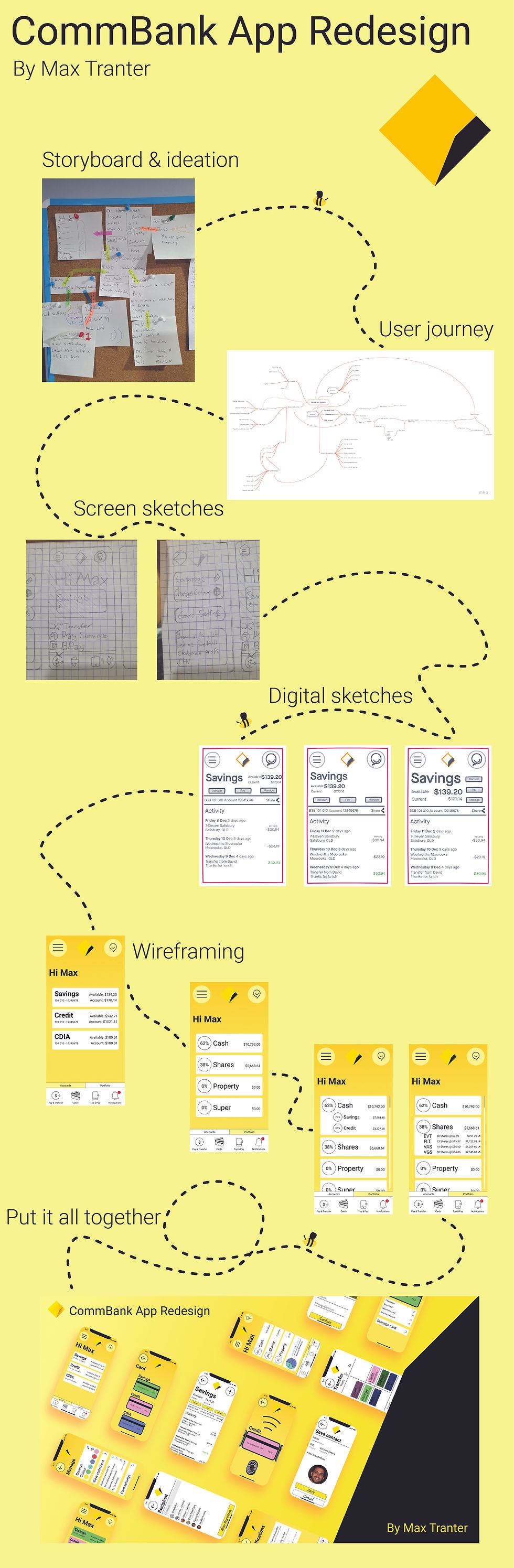
I had just created a Commonwealth bank account and was ready to download the app. I installed it, opened it up and logged in. The first thing I was greated with was a yellow blank screen only reading "Hi Max". Where was I to go from here, what am I meant to do with this big yellow square now on my phone.
Development blogs


Development process
Design goals
Identified problems
Core design and design goals
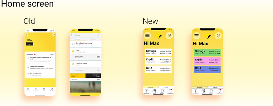
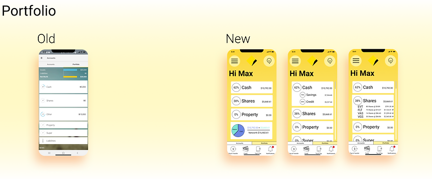
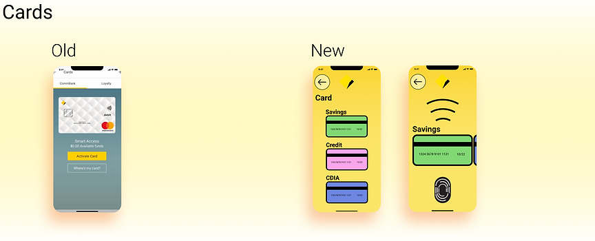
After using the app for a little bit i started to notice a few different problems. That big blank yellow screen was reserved for notifications, which personally when I sign into a banking app isn't the first thing I want to see. Further visually and functionally CommBank's app wasn't consistent. The accounts screen for example has a blurred photo of the beach as the backdrop to your accounts. Not only that but all the buttons are moved around, to me it feels like they are two seperate apps linked together.
After identifying the issues within the app, my goal is to layout the core design idea and concepts that will lead the project. The core design concepts I settled on were.
- User centred design focusing on consistency between screens visually and functionally.
- Create a clear colour palette in line the CommBank's brand identity.
- Present the most important information to the users
Screen comparisons
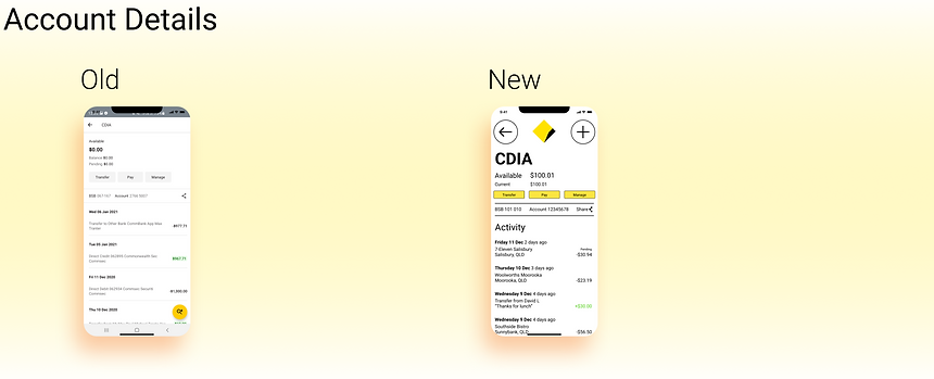
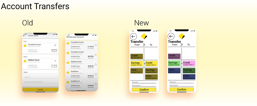
Results
After completing the design of the CommBank app I believe the layout of the app is much clearer and consistent. After testing the prototype I found that the button placement was much more consistent after the changes. Further I asked for feedback on the overall design and recieved overwhelmingly positive feedback on the visual changes.