Begining the development of the CommBank App
- Max Tranter
- Dec 17, 2020
- 2 min read
My problems with the CommBank App
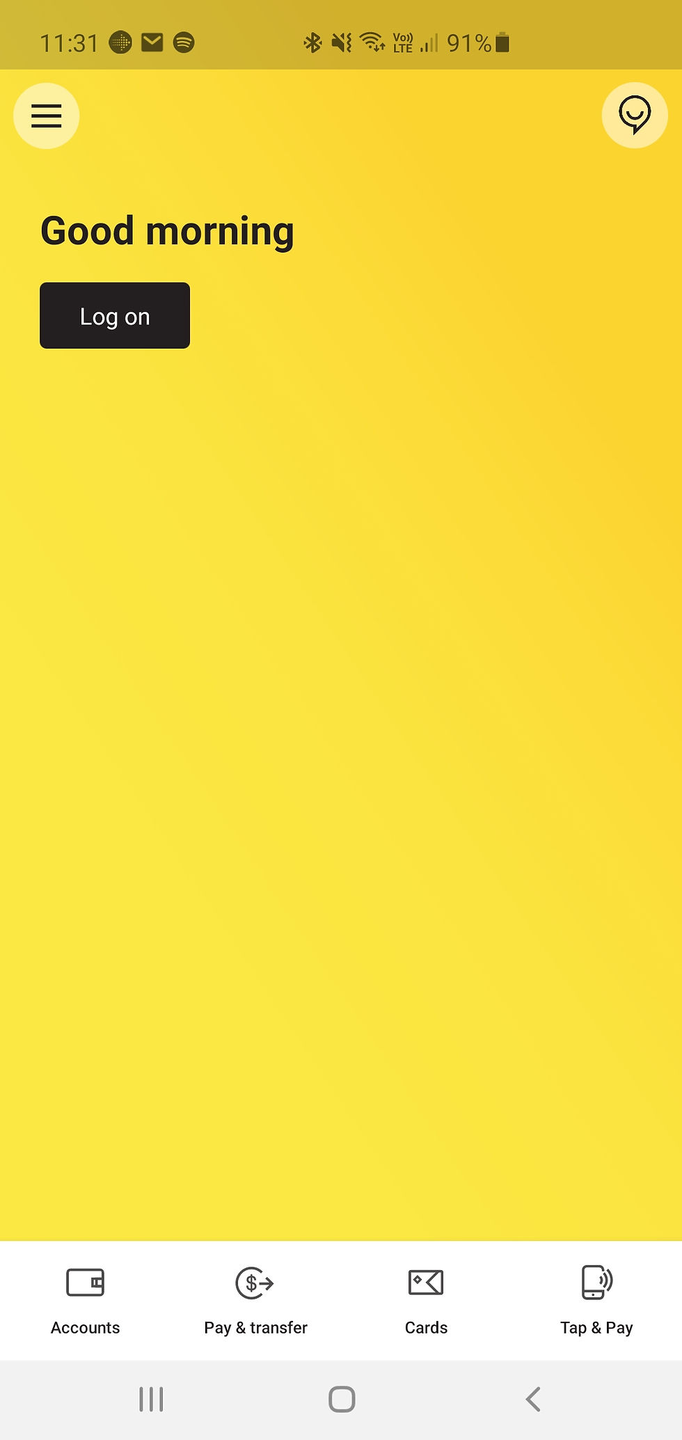
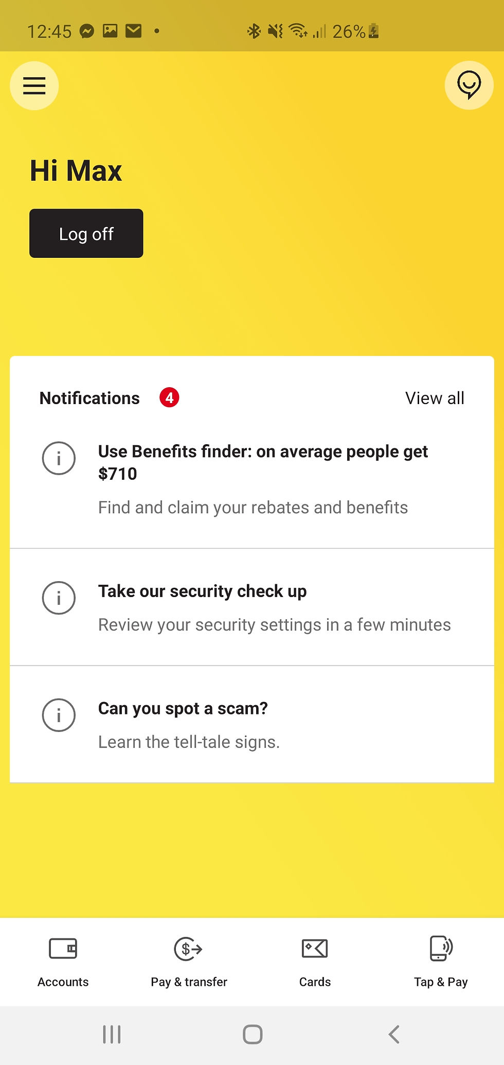
Overall I would say the CommBank App is good however there are some problems I have. The biggest problem is the opening screen, the current opening screen leaves almost the whole screen empty other than the main brand colour yellow. Usually the space will be filled by notifications however I don't believe that is the most relivent information to the user as soon as they open the app.
Below is the current landing page for the CommBank App, the major problems are the wasted space when there are no notifications, further I think the notifications could function a lot like any other major app (facebook, instagram, etc) and have a small button with a notification number and selecting said button takes you to a similar page to the current home screen.
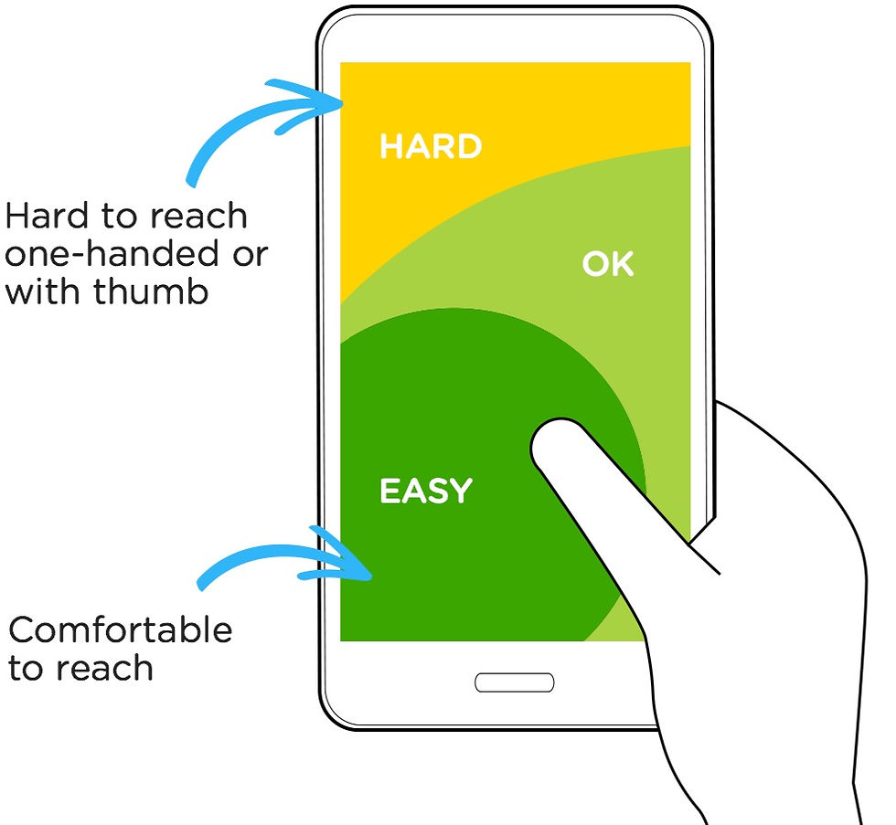
My second major problem with the landing page is the placement of the Log on/ Log off button. As phones continue to increase in size the problem areas of screen reach really come into play, here we see it clear as day with the CommBank's Log on button. Not only as a userare you greeted by an app that requires you to select the Log on button (or another button such as accounts to start on the accounts page) to gain access to your account they place the most important call to action in the "hard to reach" area of the screen, this needs to be changed.
To summaries my problems I think in almost all cases a user would rather see their accounts before their notifications upon log in and further the difficulty logging in should be adjusted to create a better flow for the users. Further there are other small changes to add more quality of life and stronger branding.


Comments